Introduction
Economic data releases have shaken up investors this month, with the major US indices all down for the month.
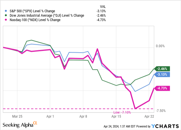
Particularly hit was the NASDAQ-100, an index widely considered analogous to the US tech sector, with a 1-month drawdown of 7.10%. This falls in line with changes in several of the key economic data points. First, I like to look at the “big three” metrics, or what I like to call the “usual suspects.”
The Usual Suspects
These three indicators, inflation, gross domestic product, and unemployment, are some of the most reported-on economic stats and dominate media cycles at their releases. This month, they tell a mixed story.
Inflation
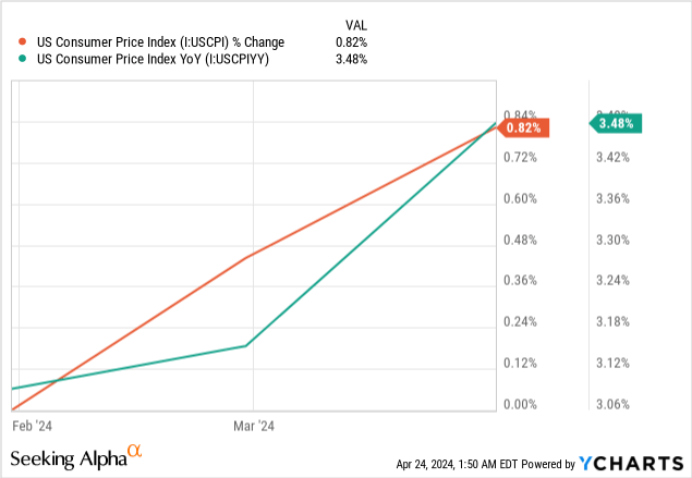
The Consumer Price Index (CPI), how inflation is measured, rose by 0.82%, representing a 3.48% year-over-year change. Rate expectations, measured by credit spreads in inflation-indexed bonds (“TIPS”), have changed recently, an indication of the market’s lower confidence in the Fed’s ability to hit its 2% target rate.
Figure 1 (FRED)
However, the Fed doesn’t use “plain-old CPI” as their preferred inflationary metric. Instead, the Fed likes to use personal consumption expenditures, or “PCE.”
Just for reference:
- CPI, the consumer price index, measures goods and services purchased by consumers
- PCE, personal consumption expenditures, measures only goods and services intended for consumption by households
An example of how these are different can be found in airline fares, among others. The Bureau of Labor Statistics writes about this example.
The PCE index for airline fares is based on passenger revenues and the number of miles traveled by passengers. The CPI, however, is based on prices charged for air travel for sampled routes.
Particularly, they like to use “core PCE,” which measures consumer spending less food and energy. This measure is more stable, since food and energy prices can be very volatile. The Fed gets some flak for this for being an unrealistic look at American living conditions, as food and energy are large expenditures for the average person.
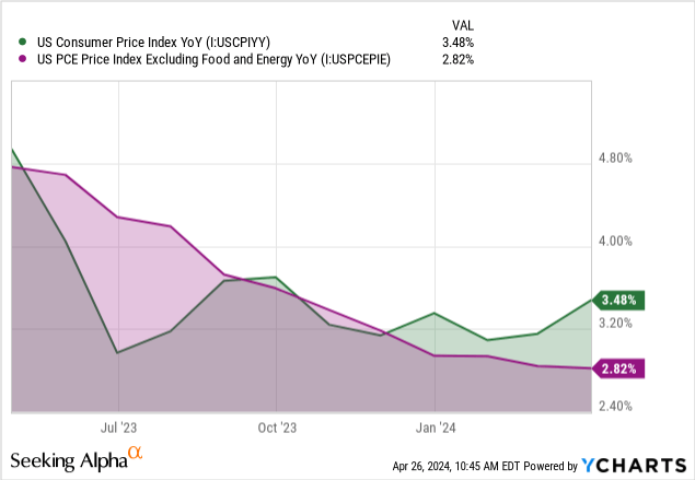
This figure is bucking the trend that CPI has established, as denoted by the emergence of the jade area above and a divergence of the jade and amethyst lines, and is likely to stay lower than inflation for the time being, since much of the inflation we have seen is in the aforementioned food and energy categories. Because of this metric staying closer to the 2% target the Fed is aiming for, I am significantly more bullish on the economy than just CPI would suggest.
Gross Domestic Product
GDP is one of the most quoted figures when it comes to the “strength” of an economy. It’s a measure of the value of all final goods produced in the country. We can see a slowdown in quarter-to-quarter results, with Q1’s results now falling below 2% for the first time since Q2 2022.
Figure 2 (Reuters)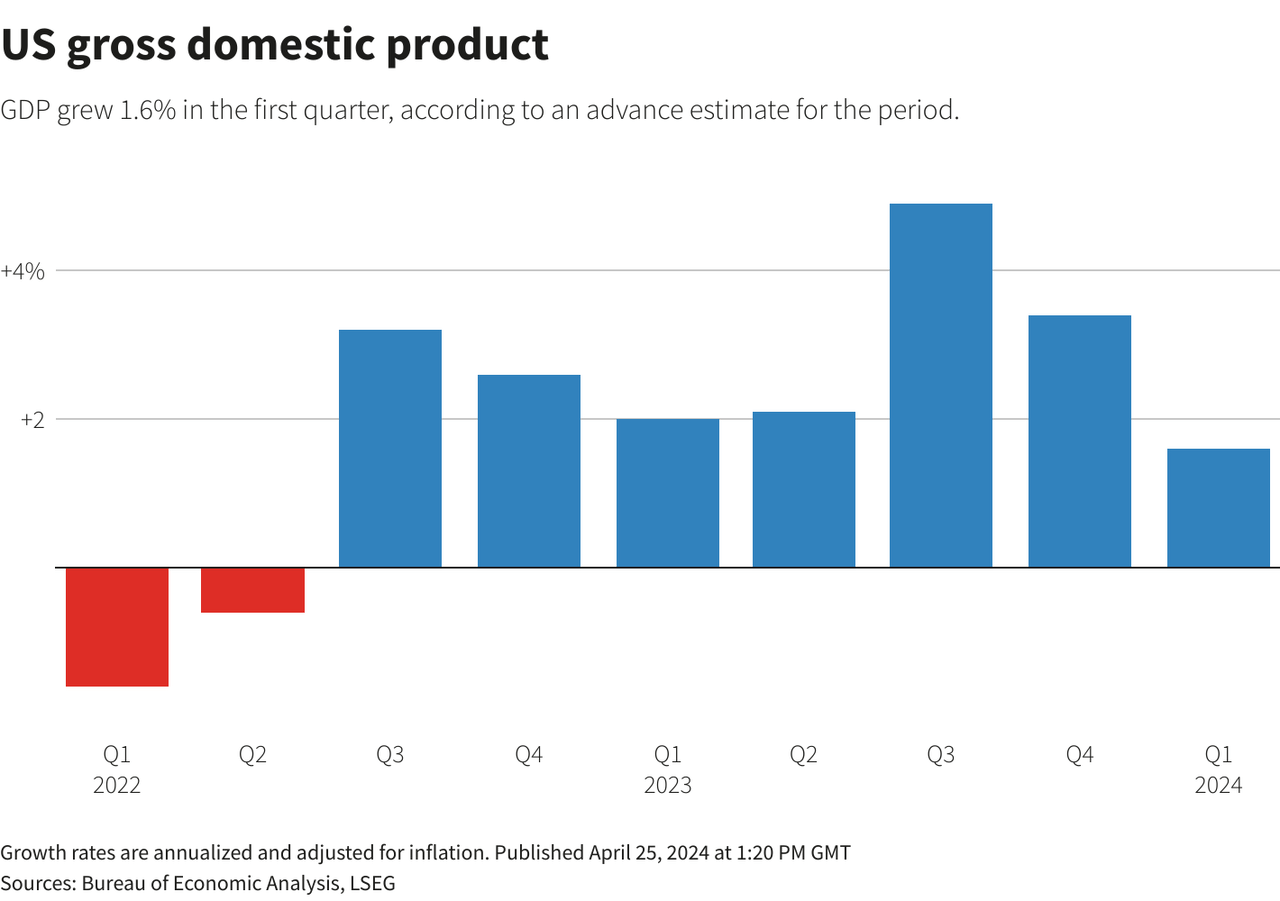
Both GDP and real GDP are on the rise year-over-year, which is a good sign, even if the growth rate has slowed.
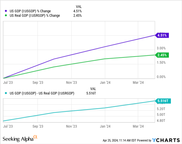
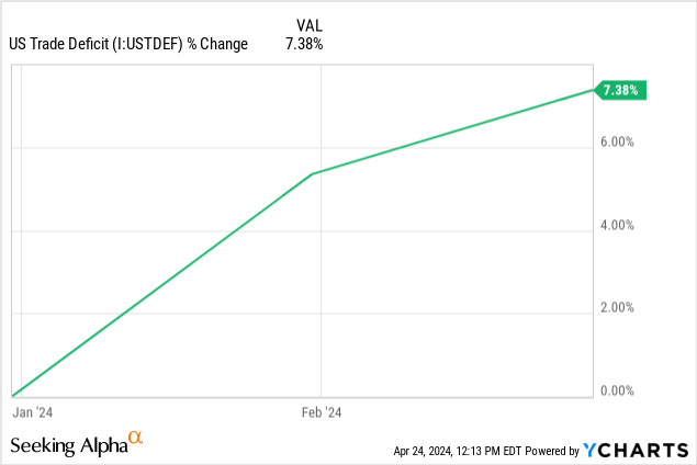
One important note here is the cerulean line above, which shows a slowing of the gap between GDP and real GDP (that is, GDP adjusted for inflation). This is important because the steepness of the gap tells us how badly inflation is hurting our growth domestically, since GDP is counted net exports and the US is in a massive trade deficit, as shown by the sea foam line below, which is a YTD measure.
One of the other metrics I find interesting in the GDP space is how population is factored into it. Since the US population consistently grows year-over-year, GDP needs to outpace it in order for individuals to feel its impacts. If GDP rises by 2% and so does the population, then the net GDP per person (“per capita”) ends up being zero.
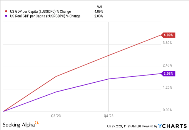
This positive metrics is good news for Americans, as it means that our productivity has increased relative to our population, and so actual growth is happening, even if there is a widening gap due to inflation.
Unemployment
This brings us to the unemployment rate, our third and final “usual suspect.” Unemployment has been on a downtrend since the 2020 lockdowns, and so far, that trend is unbroken.
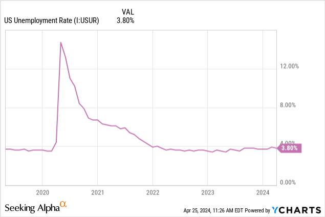
Since 2022, we’ve had an unemployment rate below 4%. This level is considered the “natural” level of unemployment, as there is an assumption that there will always be some level of unemployment at a given time and that it is impossible to actually hit zero without a planned economy (a la the USSR).
So this is a very good figure, at least on the surface.
The metric I’m more concerned with is the labor force participation rate, the garnet line below.
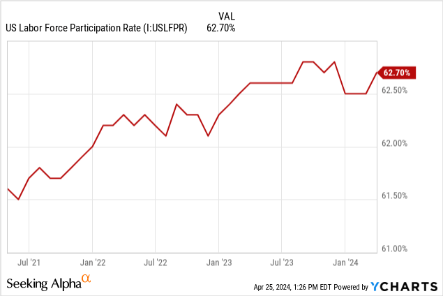
It shows the percentage of the population that is engaged in the workforce, not just the percentage of people looking for work. This figure also includes those who have given up looking for work, or who have been out of work so long that they can no longer claim unemployment.
The garnet line shows a firm recovery over the last three years. It has stagnated in the last few months, however, which is a mixed sign. While unemployment is low, we still are not back to pre-pandemic levels of employment.
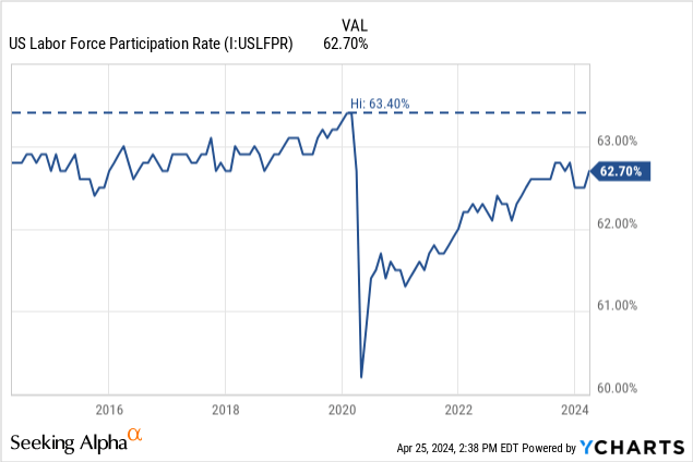
When you pull the chart back, it’s clear that we’re on a recovering up-trend, but there is no guarantee that it will recover back above the pre-pandemic average of 63%. This may be alarming, as it means that Americans “marginally attached” to the workforce, or who want a job but aren’t actively looking (which are not counted as “unemployed”), are growing in number.
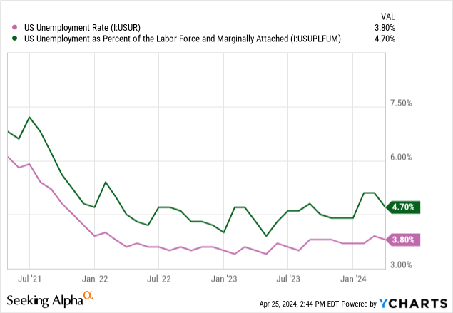
We can see that spikes in the forest line above are far more pronounced than the taffy line, showing that these folks are significantly more likely to not be counted in official unemployment numbers, regardless of the fact that they are unemployed.
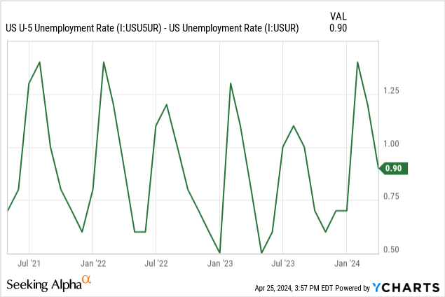
This kind of trend can be alarming, and is one that I want to look at more closely in the future, to see if the gap narrows or widens moving forward. The pine line below shows the spread between these two. As of now, it is on the downtrend. This is a good sign.
The Federal Funds Rate
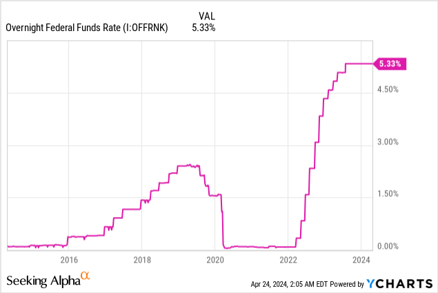
The Fed has been holding rates still, and likely intends to do so. Last month, I wrote about Jerome Powell’s press conference after the FOMC meeting. There he said:
We believe that our policy rate is likely at its peak for this tightening cycle and that, if the economy evolves broadly as expected, it will likely be appropriate to begin dialing back policy restraint at some point this year. The economic outlook is uncertain, however, and we remain highly attentive to inflation risks. We are prepared to maintain the current target range for the federal funds rate for longer, if appropriate.
This comment all-but confirmed that inflation’s “prime nemesis,” the Federal Funds Rate, would stay at its current levels for the next few meetings.
Conclusion
In this article, I covered the three economic data points that are most widely used in mainstream discussions on the state of the US economy, as well as tangential and marginal figures that are related. All told, the story is mixed.
- Inflation as measured by CPI is up
- Inflation as measured by PCE is flat
- GDP in nominal and real terms are up YoY
- GDP per capita in nominal and real terms are up YoY
- Unemployment is down and flat, below 4%
- The labor force participation rate is rising back to its pre-pandemic norm
- U-5 unemployment is up, but the spread between U-5 and U-1 is lowering and is now close to its long-term average
I am bullish on the US economy and believe that we are currently on track for a Q2 that will tell a story of lowering core inflation, persistent GDP growth, and a stagnant level of unemployment at or around the natural level.
Thanks for reading.
Read the full article here


